LOCAL BRANDS RE-IMAGINED
October 2025 | Personal Project
Disclaimer: This project is a conceptual exercise intended for educational and portfolio purposes. It is not a critique of the brands’ existing identities but an exploration of alternative creative possibilities.
Aim
This project explores the reimagining of three existing local brands through a creative lens, focusing on developing identities that highlight the brand’s services, personality and unique selling position. The goal was to strengthen my branding skills, work within a tight deadline and highlight local businesses through this project.
Solution
Each re-imagined brand presents a visual identity that maintains the brand’s core essence, while exploring new stylistic and conceptual directions, based on key aspects of their current brand personality and experience. Through experimentation with typography, colour, and illustration, I developed outcomes that reflect current design trends and audience expectations.
-
Reimagined brand identities and relevant applications for: Adnams Homes, Bella Vision Hair Studio and The Secret Garden Cafe.
-
Illustrator, Photoshop, Indesign
-
Brand identity development, Brand and market research, illustration, brand application and packaging design
All illustrations and design work by Charlotte Squire.
Mockups provided by Envato Elements.
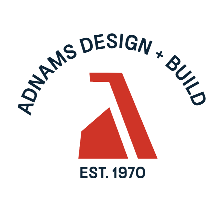
ADNAMS DESIGN + BUILD
Home Renovations & Design Company
Aim
Adnam’s Homes is a family-owned business dedicated to bringing renovations, home extensions, and builds to life for their customers. My goal was to create an alternative identity that emphasises the company’s long-term reliability and heritage, while positioning the brand confidently within the modern construction industry.
Solution
The new identity draws inspiration from architectural forms and construction tools, combining familiarity with a contemporary design approach. The logo incorporates geometric shapes reminiscent of house structures, while the colour palette references high-visibility construction tones such as orange, maintaining alignment with industry standards and Adnam’s Homes’ original brand colours.
A brand pattern derived from the logo evokes the texture of tyre tracks, commonly found on job sites, reinforcing the brand’s hands-on and dependable nature. The reimagined website highlights testimonials and the family-led story behind the business, strengthening the tone of trust and reliability. Additional branded applications, such as vehicle signage that extends the identity across key touch points to improve brand recognition and cohesion. I also reimagined the brand name to create a smoother, more memorable flow that better reflects the company’s services and approachable personality.
THE CURRENT LOGO
THE RE-IMAGINED LOGO


BELLA VISION HAIR STUDIO
Hairdresser Studio
Aim
Bellavision Hair Studio is a local salon with a young, passionate team of stylists dedicated to their craft. I selected their branding to reimagine, as I wanted to highlight their creative energy and modern edge, while preserving their established identity.
The goal of this rebrand was to modernise Bellavision’s visual presence to better connect with their younger audience, emphasising the studio’s edgy yet feminine personality, while also creating consistency across assets. The project also sought to differentiate Bellavision from competitors and explore new branded touch points that communicate their confident and inclusive tone of voice.
Solution
The reimagined identity balances sharp, high-contrast elements inspired by scissors with soft, feminine touches such as a predominately pink palette and expressive script typography. This contrast creates a distinctive brand presence that feels both bold and approachable.
The re-imagined identity further extends Bellavision’s tone of voice through new branded applications, including social media assets and in-store mirror stickers to reinforce the studio’s personality and core values through everyday customer interactions.

THE RE-IMAGINED LOGO
THE CURRENT LOGO

CURRENT SIGNAGE

RE-IMAGINED SIGNAGE


THE SECRET GARDEN FERNY HILLS
Family friendly Cafe
Aim
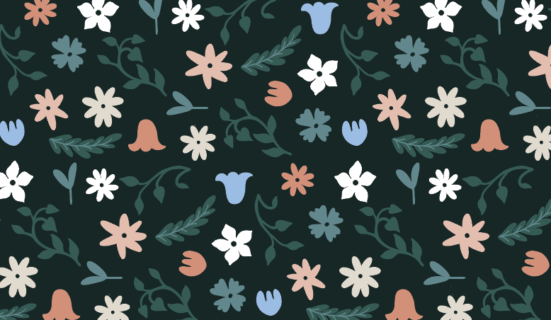
The Secret Garden Café is a relaxed, outdoor, family-friendly space with designated play areas and activities for children. My goal in reimagining the brand identity was to emphasise the “secret garden” concept and create a look that feels approachable and friendly for young families, while still maintaining an elegant and cohesive aesthetic.
Solution
Floral elements and key-inspired motifs tie the identity back to its source concept, while soft, natural colours create a calm and grounded atmosphere. The café already features sloth-themed decorations and activities for children, so this motif was integrated into the kids’ touchpoints to maintain their existing charm and differentiate between the adult and child-focused brand applications. This balance of sophistication and playfulness reinforces The Secret Garden Café’s unique, family-oriented personality.
THE CURRENT LOGO
THE REIMAGINED LOGO


Check out my other projects here:


